Back

2021
eDreams is one of the world’s leading online travel agencies. For two years, I worked with the Native team, focusing on user engagement. I led the design of an in-app inbox to boost retention, app relevance, and reduce support calls.


I researched competitors' approaches to the problem and found that some, like Caixa Bank and Banco do Brasil, used categories to organise and clarify messages.
Most inboxes I studied allowed users to scan, triage, read, respond, and react to messages, with a focus on delivering relevant content. However, some inboxes were cluttered with marketing and irrelevant information.
I develop an initial prototype adhering to these standards with the goal of testing and learning about how users navigate through the app to find information related to their booking issues.


Insights gathered reveal that the concept did not convincingly solve with our problem, as users found it complex to navigate, lacking quick access to information.
To address this, I optimize the browsing experience by highlighting categories, providing better support, and guiding users to the relevant inbox messages.

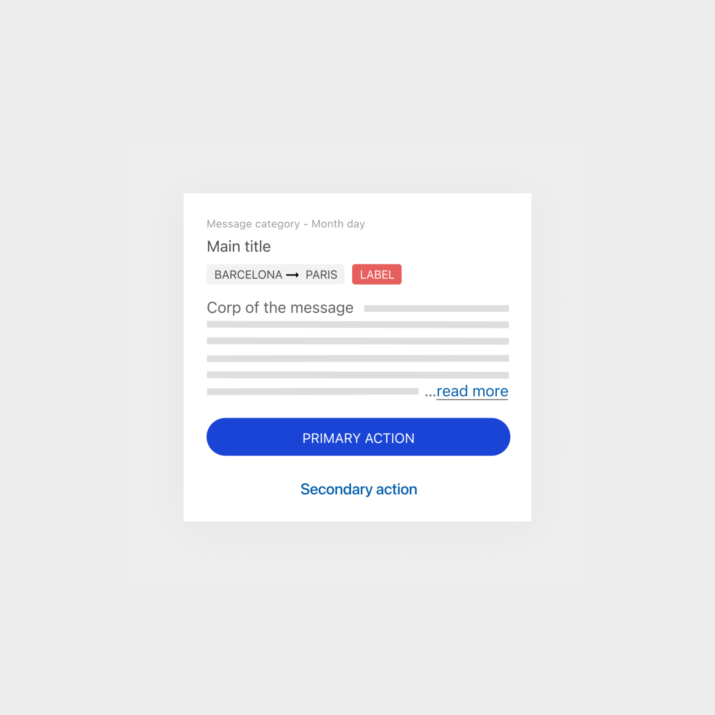
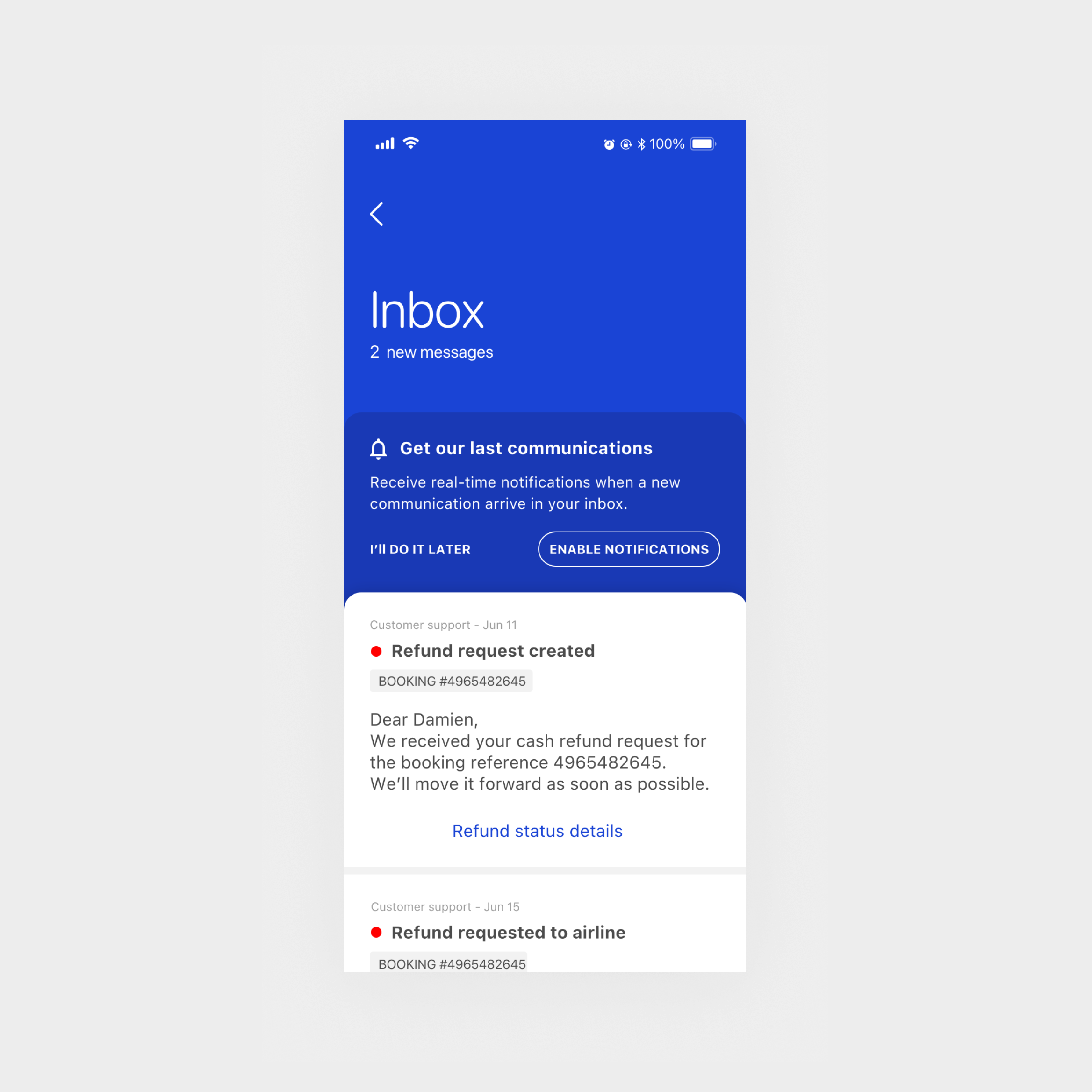
The first launch of the inbox primarily aims to focus on customer support topics such as flight cancellations and the refund process.
Therefore, we adapt the vision into a minimalist version to ensure that we deploy the right value at the initial launch while establishing standards for future improvements and other types of communications.
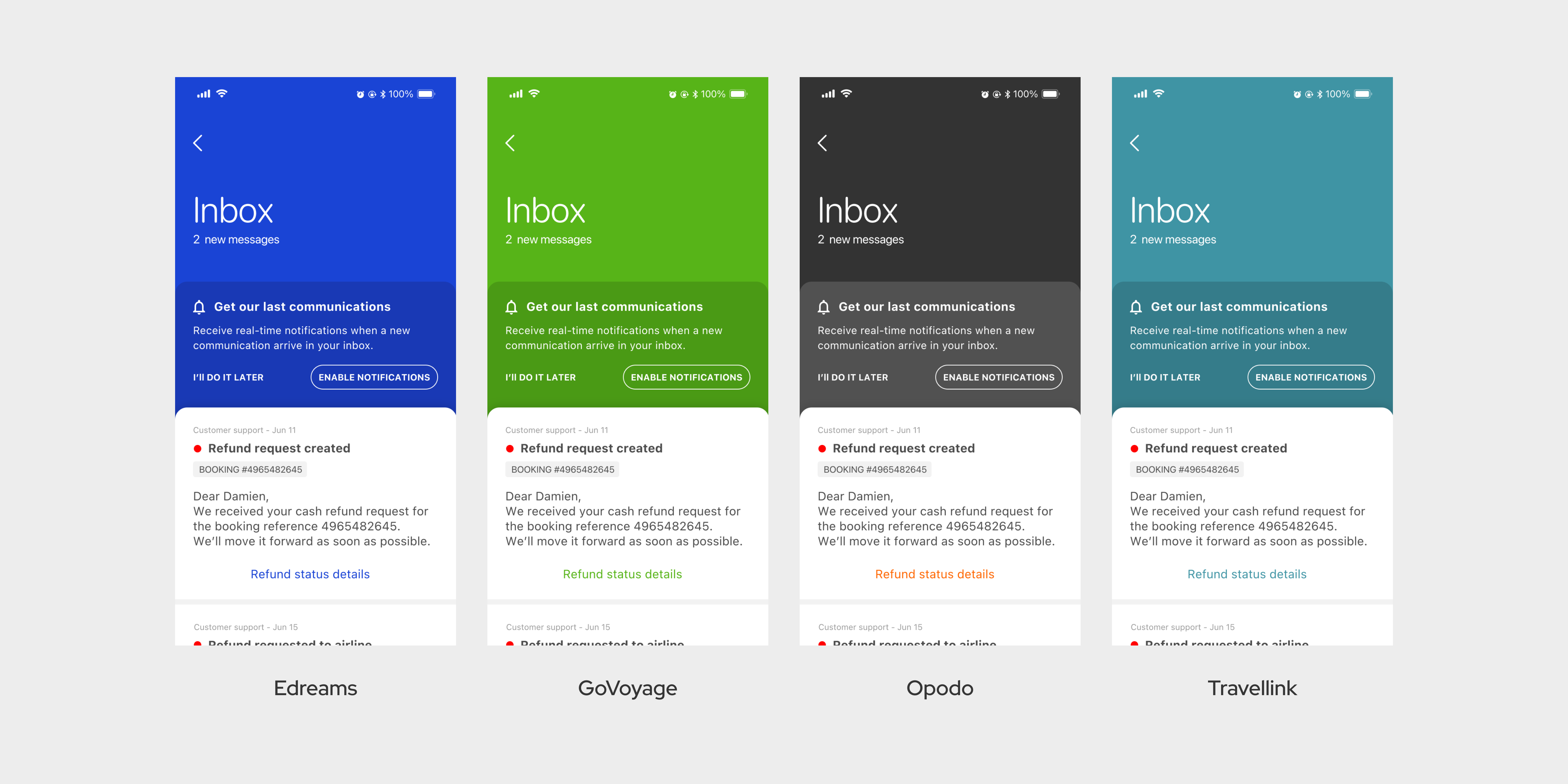
I also ensure that the final specifications seamlessly adapt to our various brands: Edreams, GoVoyage, Opodo, and Travellink.


